
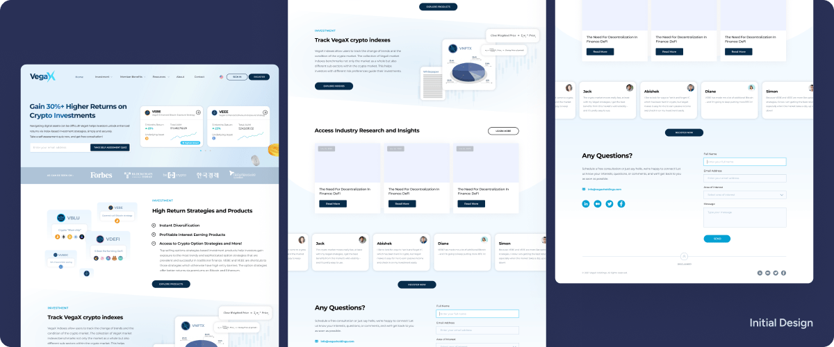
VegaX landing page, the gateway to their investment products, was plagued by a low conversion rate and a high bounce rate. These metrics indicated that a substantial proportion of visitors were leaving the site without taking any action, signaling a need for immediate improvement.
To gain a deep understanding of the usability issues hindering VegaX's landing page performance. Since my team doesn’t have the luxury to invite users to do user interviews. I decided to do a research using tools such as Google Analytics & Hotjar already installed on the landing page. Google Analytics provided valuable insights into website traffic, user behavior, and conversion patterns, allowing me to identify areas of friction and potential areas for improvement.
Hotjar heatmaps revealed the visual elements that attracted the most attention and the areas that visitors were overlooking, providing clues about the effectiveness of the page layout and content hierarchy. By leveraging these 2 tools, I get to know the root of the problems even without user interview.
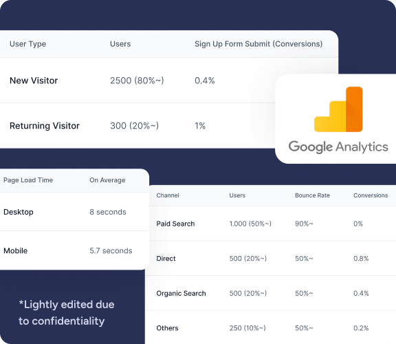
Here are some of the key findings I could find by leveraging this tools:
*Due to the confidentiality, I may not be able to provide more details in this case study
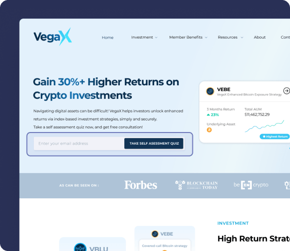
Key Findings 1
Self-assessment quiz is not a good CTA as users only click this CTA 2 times which is <1% out of all clicks.
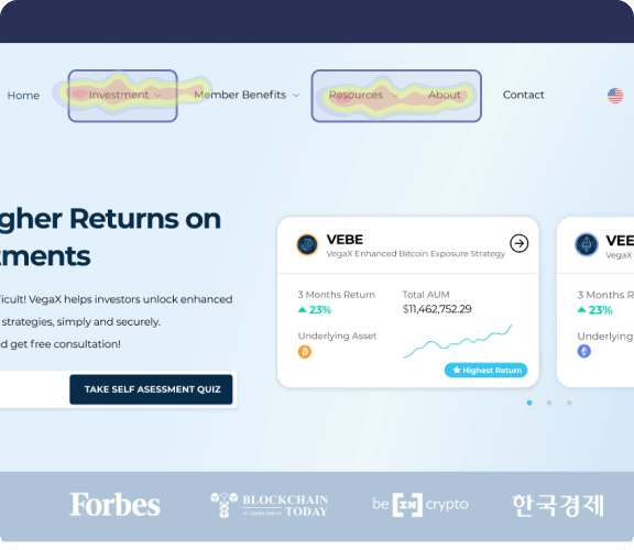
Key Findings 2
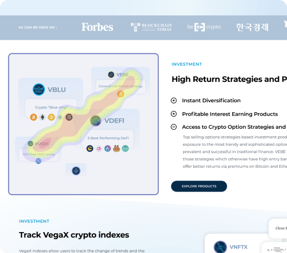
Key Findings 3
Many users click this section in the hope of finding more details about the product since the section on the right doesn’t provide a detailed explanation such as the risk profile.
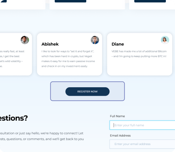
Key Findings 4
This register button at the bottom, no one actually click there (0% click rate)
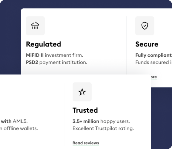
Key Findings 1
Shows that the investment made are secure and safe
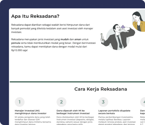
Key Findings 2
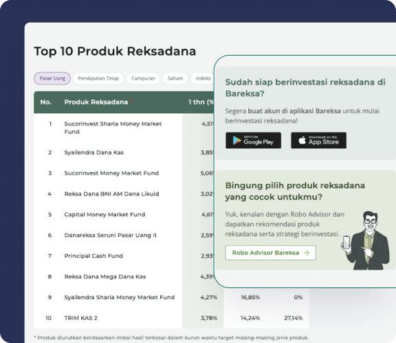
Explaining to users in details about the product, how they work, and why should they join us (What, How, Why)
Key Findings 3
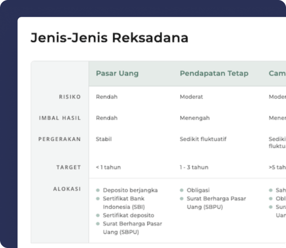
Comparison Chart that explain more details about the product and its difference
Key Findings 4
To address the identified UX problems, I proposed a comprehensive set of design solutions aimed at enhancing product information, strengthening the value proposition, introducing interactive elements, and optimizing website speed. I did a presentation and proposed these design solution to the PM and COO.
Enhancing Product Information
Strengthening the Value Proposition
Introducing Interactive Elements
Optimizing Website Speed
Following our analysis presentation to the COO and PM, we began creating semi-hifi wireframes for the redesigned structures based on the UX research findings. Below are some of the main wireframe concepts.
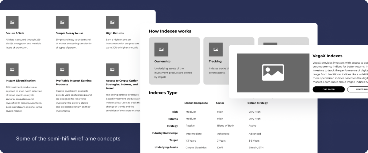
After discussing these wireframes with the team, we decided to combine the best elements from each wireframe concept to create a final set of redesigned pages depicted here:
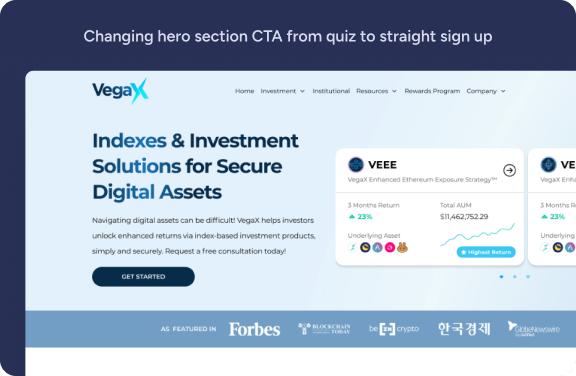
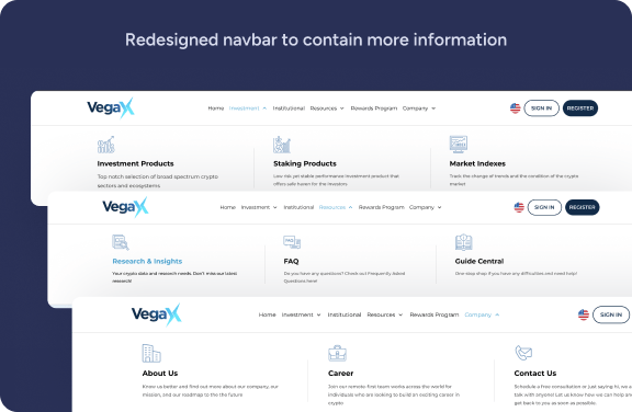
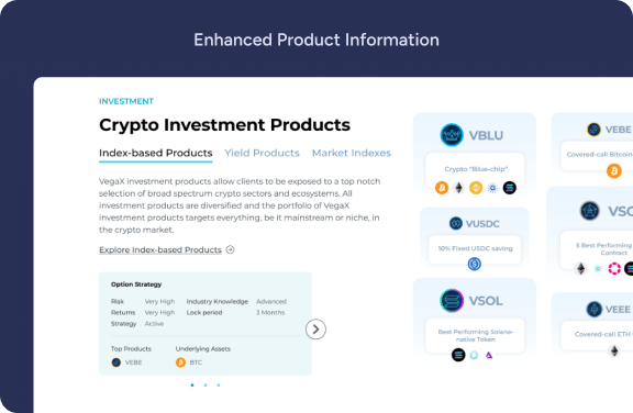
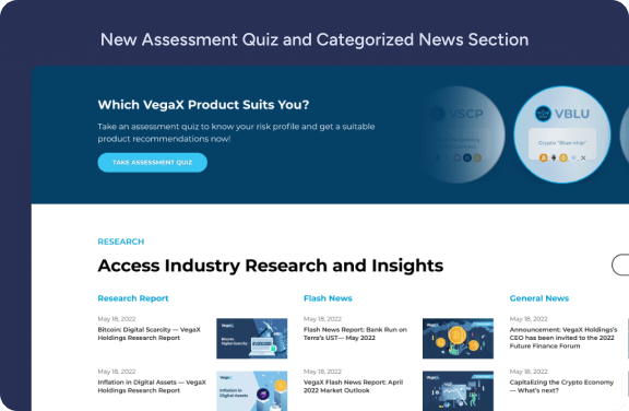
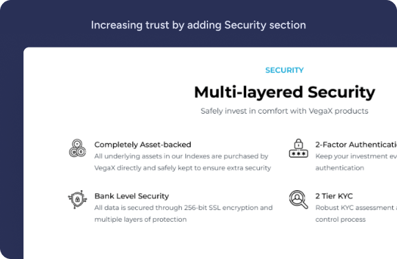
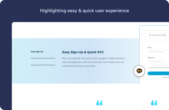
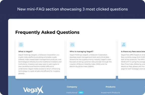
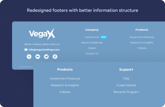
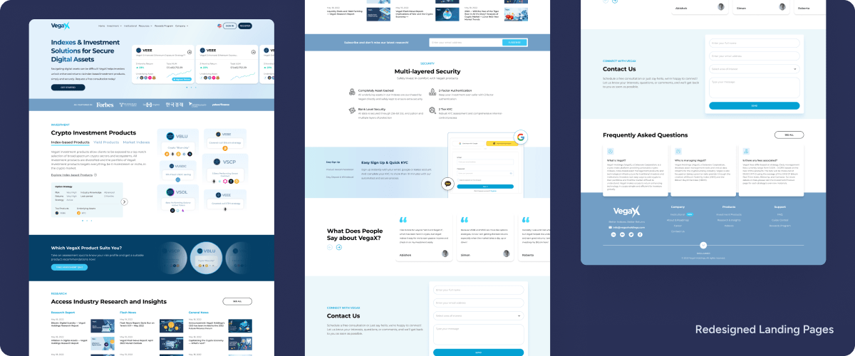
Highly interactive prototypes provide a realistic simulation of the user experience, allowing designers and stakeholders to better understand how users interact with the interface and identify potential usability issues. You can try my prototype below! (I recommend to open this fullscreen on another tab)
As the only UI/UX Designer aside from VP of Design, I was fortunate to work with an extremely talented team. We worked hard on improving the designs of the company, therefore it was really sad to learn that due to turn in market and uncertainty made almost all teams get laid off. The company had a change in overall strategy and potentially won’t be using this redesign as this redesign is more focused on retail investors (B2C). As a result, this design may be postponed until an indefinite time or even changed to adjust to future situations or new target audience.
Even though the project is cancelled, I learned the importance of conducting thorough UX research to identify problems and inform design solutions. I also learned the importance of effective design communication and collaboration with stakeholders.


